Finding Bravery in Design with Jessica Alice

Stylist: @jessicaalice_design
Architect: @philip_stejskak_architecture
Photographer: @jack.lovel
![]()

![]()
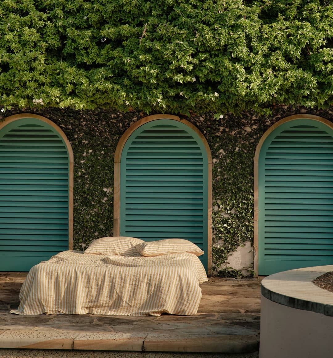
For interior designer Jess Alice of Jessica Alice Design, the story begins with textiles; afternoons spent in fabric shops, soft materials stacked around the house and a childhood fascination with reaching out to touch whatever pattern caught her eye. Today, that early love of materiality is woven through her interiors, and we’re thrilled to see it reflected in the way she styles Carlotta+Gee linen.


Linen Sheet Set in Yellow Stripes
Her refined, tactile approach is showcased beautifully in her recent work on Henville Street House in the artistic suburb of Fremantle, WA. Just 30 minutes from Perth, the award-winning project pairs raw timber panelling with polished concrete, allowing the softness of Carlotta+Gee’s 100% French linen to bring warmth, pattern and gentle texture into each bedroom.


From bold palettes to rammed-earth retreats in WA’s South West, Jess shares how she designs with curiosity, confidence and community at the centre, along with her favourite picks from the C+G collection and the colours she believes will shape the year ahead.

Jess, what fantastic interior design style you have - we loved reading about your work in Green Magazine. Tell us, how did you get started?
I began my career in interior design straight out of school with a commercial design and build company in the UK, but I believe my true start came from the women around me. My mum is a curtain maker and a designer at heart, even if she doesn’t see herself that way. I grew up surrounded by puffy curtains, afternoons in fabric shops and a fascination with textiles. Apparently I was reaching out to touch fabrics from my pram! That early love of materiality has never left me. Today, when I design interiors, I am instinctively drawn to layering textures and patterns, something I trace back to those influential years in the English countryside.
Being from WA, do you notice any key trends that are unique to that region?
I often find myself joking about how white the interiors are here in WA, and I’d love to see people feeling braver with colour. There is still a strong focus on designing with resale in mind, with many worrying about how the next buyer might respond or whether it could affect value. Personally, I believe your home should be designed for you, not for the next person. I feel very grateful for the people I’ve met here, and through my work in editorial styling and research I’ve been drawn to so many incredible makers and artists. I strongly believe in the value of collaboration and in building a community where we all support each other.


How did you approach the styling of Henville House overall?
The Architect, Philip Stejskal describes the house as “intentionally understated, with an emphasis on spatial arrangement and tactility of materials where it counts.” I look that as our brief. We focused on creating spaces that felt calm and quietly expressive, nothing too forced or overly decorated. I love playing with old and new, soft and structured, the materiality within the home was a wonderful base for us to work with and layer furniture into. The goal was for the house to feel like a beautiful, evolving home rather than a frozen moment in time.
Fremantle is such an interesting, artistic area of WA; did this atmosphere inform your work on this project?
Yes, very much so. I’m incredibly passionate about working with local makers and artists, as their work tells a far more authentic story. Fremantle has a rich creative energy and a strong sense of individuality, and it felt important that the project reflected that context rather than feeling disconnected from its surroundings. Incorporating locally made pieces allowed the home to feel grounded, layered and genuinely reflective of the area’s character, celebrating both Fremantle and the people behind the work.


Linen Sheet Set in Olive, Pillowcase Set in Marine Blue
What are the colour palettes you see as being popular in 2026?
In 2026, I see palettes becoming more confident and layered, moving away from the safe neutrals that have dominated in recent years. In Australia, there is a natural connection to earthy tones, soft greens and warm clays that reflect the landscape, while in the UK I often see deeper, moodier palettes with rich blues, ochres and burgundy tones. What excites me is bringing these influences together, pairing grounding, nature-inspired shades from Australia with the bold, saturated hues often seen in the UK. The result feels both fresh and timeless, and I hope to give my clients the confidence to mix that into their homes.
Talk us through your selection of Carlotta+Gee linens for the Henville House project.
Carlotta + Gee felt like a natural fit for Henville House, your linens can be styled in a way, that doesn’t look over styled, they’re relaxed and natural, which was exactly the tone we wanted to create within the Henville House project.

Are there any interesting projects you’re currently working on?
Yes, I’m currently working on some really exciting interior design projects. Two 70’s style homes to get my teeth into, it’s really interesting looking back at that era and how much is showing up more and more within design today. Another project in Margaret River has been especially rewarding, as I’ve been given an incredible amount of creative freedom and trust from the builder. I cannot wait to share this one, when we shoot it I’m hoping to style it to showcase my favourite WA artists and makers.
Alongside my client work, a passion project that is coming to life is Studio Plinth, which I’ve co-founded with architect Rosie Burton. Together we’re celebrating considered design and craftsmanship through a curated collection of furniture available for hire for photoshoots and projects. Our vision is for Studio Plinth to become a valuable resource for architects, interior designers and stylists across WA.
We’re so happy you’re a linen lover - can you share which are your three favourite C+G colours?
The obvious one is going to be Chocolate, my little studio is mission brown. I’m obsessed. A random favourite is the Pinot and of course, French Navy!

